Coindesk
Head Navigation V2
UX Research / UX Design / UI Design

Problem
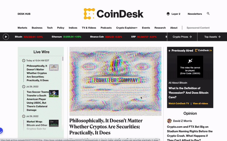
The MVP's header navigation had an overly tall height, resulting in the main articles being pushed down the page. This, in turn, created a situation where users landing on the page initially couldn't easily see the content without having to scroll down.
Furthermore, when a high-impact advertisement was present at the top, it almost entirely obscured the page, dominated by advertising and the header navigation.
I was the lead designer developing the strategy for better user experience for head navigation. The goal of our project was to create a more compact but user-friendly and scalable global navigation.
I partnered closely with cross-functional teammates from Project Managers, Editorial team, Marketing team, and Engineering to ensure that the product provided user value to both sets of customers.
What I Did
UX Research, Competitive Research, design thinking workshop planning and facilitation, User Testing, UX Design, UI Design, Rapid Prototyping, Usability evaluation
Project Timeline
Design + Research Time: 3 Months (March 2022 - June 2022)
Project Time: March 2022 - September 2022
(Until the MVP launch)
Opportunity
-
How might we create a more compact but user-friendly and scalable global navigation?
Out Comes
-
More scalable navigation for the future contents and additional sections
-
Increase 20% for the space for the main content on the site
-
Less intrusive header when the user browsing through the website
Feedback from Users on MVP Head navigation
We receive a few feedback on Hotjar.
“I just wanted to see the chart but the ads and the menu bar are hiding. I can't see.”
“The top navigation basically takes over more than half of the page. It is wasting a lot of space on the top.”
“The scrolling effect on the top navigation is really annoying.”
📍Goal
Creating a compact, user-friendly, and scalable global navigation was our goal.
Research
01
The head navigation takes up a significant portion of the page's real estate and can push down important content, affecting the user experience.

02
Intrusive scrolling behavior
The collapsing and expanding of the navigation can interrupt the user's reading experience and browsing on the website.
03
Similar issues go on the mobile version.

04
The user normally bounces even before they reach the main content.
Users tend to bounce immediately upon landing on the page without scrolling down.

Evaluate again the CoinDesk's MVP design.

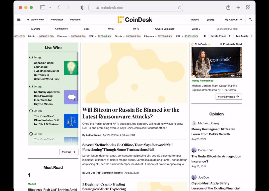
New Designs

Components
Desktop
Head Navigation before sign in SSO
Head Navigation after sign in SSO
After the user scrolls down and then back up a bit, a more compact version of the header navigation will be displayed
Head Navigation with breaking news bar


Dark Mode
Head Navigation with breaking news bar
Compact version head navigation


Mobile

Light Mode

Dark Mode
Upon scrolling down and then up slightly, a condensed version of the header navigation will appear.


Scrolling Behavior
Much more concise on the header
Desktop
Mobile

With in-house ads


More Scalable Header
Increasing the available space for the primary content

With Ads

Positive Impact
I left the company right before the developer started developing the project. Therefore will not have detailed data for the impact afterward.***
More Scalable, More Space
Give more room for future content categories as the crypto field is constantly growing.

